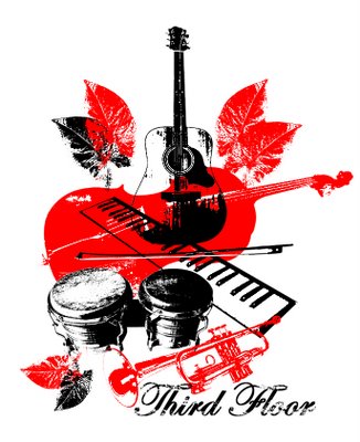


Some friends asked me to design a "band logo" for thier World Music band. You know who you are, so here you go. Let me know what you think, everybody. My personal favourite is the black/red one, but that's me.
-Dave
Wednesday, August 09, 2006
Quick Post: Let me know what you think
Posted by DAve and JAnie at 10:53 PM
Subscribe to:
Post Comments (Atom)


11 comments:
The black red one has a really cool "we play great music in smallish venues" arthouse feel. The one that I connected with first was the black one with the lights on on the third floor. It feels fun, approachable, smart.
Great job on these!
I definately like the second one, the cartoony brownstone. That one is by far the most appealing to me. I kind of like the red and black one but it's a bit too obvious for me.
i really like the black/white sketch of a three story building.
awesome.
:) see ya soonish.
black/red is my choice
You have no idea who I am, but I found your blog and I'm enjoying it!
I like the second design the best! It is great!
I like all of them, but I think the second one is my favourite. The black/red one is great, but I think it's too cluttered to be a logo - in my mind, a logo should be something that anyone can draw (at least recognizably well).
Thanks DAve!
-Matt
I pick the second one too. I think it'd make a great t-shirt.
I liked them all, but 2nd one for sure best! Very cool
this is not sue, this is janie, writting from her computer in Sarnia where we have been for the last few days.
I think the second one, the sketch of the three story building, was the first one dave did, and it is my favorite one. I think he has some more ideas that aren't quite done yet, but i will encourage him to finish those ones too!
I will blog when home on tuesday, wednesday.
Janie
-janie
*DAVE FROM SUE'S HOUSE*
Bandmembers, please tell me that you know that the robot was a joke.
-D
i seem to agree with the many who enjoy the second one (the sketchy...not bad sketchy, good sketchy one)....and i like the robot, even if he was a joke. maybe he can be our mascot....we'll wait and see. can we borrow one of your transformers? maybe we could write a song about transformation and have someone transform the thing on stage....oooh, that'd be awesome....ok. later. thanks so much DAve! you did awesome.
Post a Comment